
Customizing Widgets
This page shows you how to customize widgets, and gives some examples of what kinds of neat tricks can be done with widget customization.
As we've already said, widgets are what Archetypes uses to
display individual fields. Archetypes' built-in templates,
base_view,base, and
widgets/field
use each field and the field's associated widget (specified
in the schema) to determine which widget template to use.
However, you can override a widget's template, as we will
show below. Furthermore, you can create a whole new widget
class, which will have data and operations specific to the
display of your custom data type. Read the next section to
determine how much widget hacking you need to do.
How to Determine If You Need to Create A Custom Widget Class
If you cannot find a widget in Archetypes or in a readily-available third-party product that does what you need, use the following set of questions to determine if you can just customize the template versus creating a new widget class. If you answer "no" to the following questions, a custom template is all you need:
- Does the display of your field require helper functions to do conversions or formatting that would be difficult or cumbersome in TALES?
-
Do you have multiple AT-based classes where some fields
in those classes share all of the the following
characteristics?
- The same data type
- Similar, needs for display
- One or more attributes that are class-specific that apply to the display (i.e. the most appropriate place to set these attributes is in the schema definition)
- Does your custom data type need some super-specific marshalling when edited or searched that you can't get from any standard AT widget class?
-
Do you need to override or change the way that
Archetypes handles the processing of the
editform for a particular field?
If you answered yes to most of the questions, then you might need to create a Widget class. If the questions aren't clear, take a look at the RichDocument tutorial . If you've got a specific enough use-case (like RichDocument) that you need custom widget classes, you're probably able to make it happen just by the sheer fact that you know you need them.
Customizing Widget Templates
Creating custom widget templates is not hard, so don't be afraid. I assume if you're reading this far, you've already determined that you don't need a custom widget class, and just need to tinker a little bit with how things are done by default.
First, you should understand what you have control over by
customizing a widget template itself. You're controlling
the display of the widget's data, but not its
label. For a StringField called
myfield, the default display is something like:
myfield: some value
The only thing we can control is the display of what comes after "myfield:", which is just the data contained within the field itself (we'll talk about how to customize the display of labels later). However, if we customize the template, we can insert all kinds of nifty HTML into there! Take a look at the default template for StringWidget, 'widget/string'. It's pretty straight-forward. As you can see, there are three important macros in a widget template:
-
view -
edit -
search
Widget templates must define all three macros, however we can pass-through to the default when we aren't customising.
Don't concern yourself with the
edit
and
search
macros; remember, we're customizing the view.
Let's start by creating a new skin template called
my_string_widget. Start with this:
<html xmlns="http://www.w3.org/1999/xhtml"
      xmlns:tal="http://xml.zope.org/namespaces/tal"
      xmlns:metal="http://xml.zope.org/namespaces/metal"
      xmlns:i18n="http://xml.zope.org/namespaces/i18n"
      i18n:domain="plone">

  <head><title></title></head>

  <body>

    <metal:define define-macro="view">
      <metal:use use-macro="context/widgets/string/macros/view">
        <metal:fill fill-slot="inside">
           <span tal:content="accessor">Content</span>
           <span>is the coolest field data ever!</span>
        </metal:fill>
      </metal:use>
    </metal:define>

    <metal:define define-macro="edit">
      <metal:block use-macro="context/widgets/string/macros/edit" />
    </metal:define>

    <metal:define define-macro="search">
      <metal:block use-macro="context/widgets/string/macros/search" />
    </metal:define>

  </body>

</html>
(NB: I'm breaking AT's naming convention here. You don't
have to do that, but I find it more convenient and
understandable to add a
_widget
to the names of my widget templates)
Notice we didn't copy the definitions for
edit
or
search, we also get the default template to generate the markup
surrounding the view widget, and just populate the
inside
macro.
Also, notice how there is no display code for the label;
that's handled elsewhere. If you're wondering where the
accessor
variable comes from, that's part of the widget display
code. The widget class defines the following local
variables that are accessible inside widget templates:
-
accessor - The accessor method for the field. Call it to retrieve the value of the field.
-
fieldName - The name of the field.
-
widget - The widget object for the field.
-
field - The instance of the field class itself.
-
mode -
Will be
vieworedit, based on the action being taken. For our purposes, it should always beview.
Now, let's modify the way that our StringField displays.
For brevity, I'll just show the
view
macro:
Then, we should tell our type's schema to point at the new
template, by setting
macro:
StringField('myfield',
    widget=StringWidget(
        label='Myfield',
        label_msgid='ATViewTutorial_label_myfield',
        description_msgid='ATViewTutorial_help_myfield',
        i18n_domain='ATViewTutorial',
        macro='my_string_widget',
    )
),
Be sure to restart Zope and reinstall using
portal_quickinstaller. Now, our StringField, when rendered, looks like this:
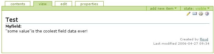
Custom Widget
Yes, folks, it's just that easy.